Michael Buenaventura
Digital Designer
Portal App
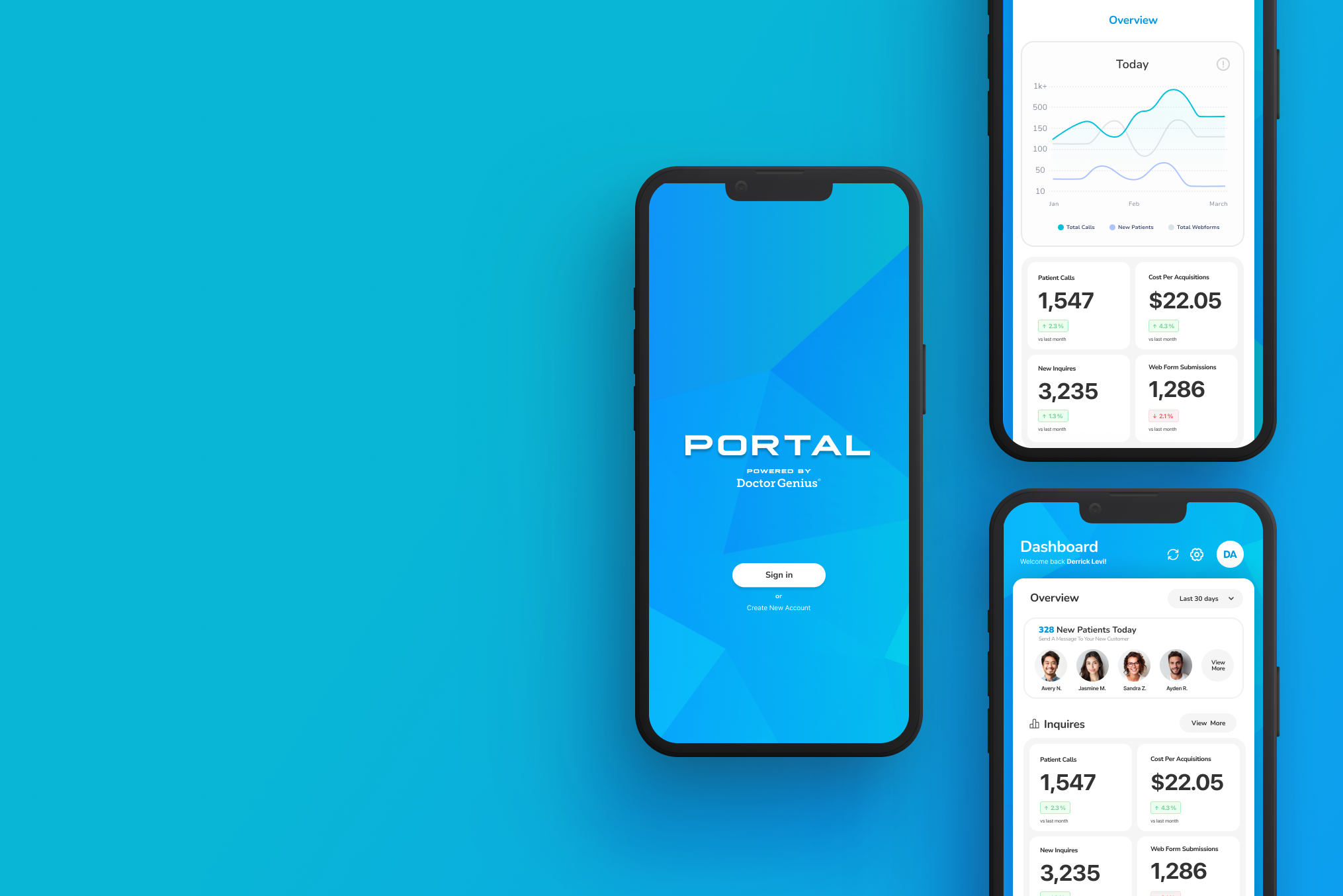
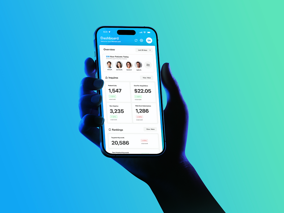
The Portal app puts vital business growth metrics directly into the hands of busy practice owners. The user-friendly interface delivers instant insights on the go. Performance tracking becomes completely effortless, keeping leadership connected to important milestones without needing a desktop setup.
Role
UX/UI Designer
Client
Doctor Genius
Timeline
18 Weeks
Platform
iOS & Android
Problem statement
Organizations need real-time data to compete, but cluttered mobile dashboards make small-screen interpretation frustrating. This poor on-the-go experience causes monitoring delays, paralyzes decision-making, and ultimately leads to missed business opportunities.
why is there a need?
Practice owners needed a quicker way to access their growth data while on the go, without the complexity of a desktop dashboard.
How can I support them
The app enables managers to access key reports and production data, allowing them to review performance metrics and make informed decisions anytime, anywhere.
Research Insight
In the healthcare marketing space, we know our users. Practice owners are balancing patient care, staff management, and clinic growth. They don’t have 15 minutes to pinch, zoom, and scroll through spreadsheets on a 6-inch screen.
Target Users
They are medical, dental, or therapy clinic owners managing 1 to 3 locations. They wear two hats: treating patients full-time and managing the financial health of a growing business.
Persona #1: Healthcare Owners
Decision-makers who need real-time insights to optimize operations and profitability.
Persona #2: Practice Managers
Professionals responsible for day-to-day operations, tracking performance, and ensuring efficiency.
Engagement Gap
Without on-the-move KPI access, tracking daily performance across remote teams or multiple locations becomes difficult
Decision-Making Delays
Relying on desktop or email-based reports slows decisions, risking missed opportunities and delayed issue responses.
Accessibility Problem
Healthcare practice owners and managers are frequently mobile, with no quick way to check live business data on the go.
Design Process
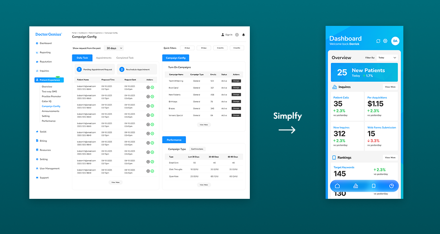
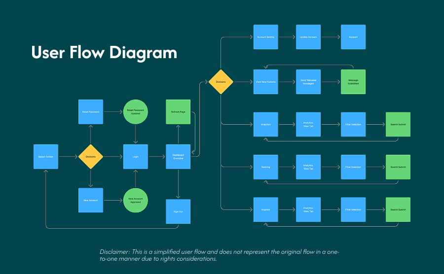
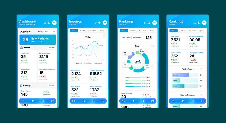
We couldn't just shrink the desktop experience. We had to rethink it. We stripped away the deep-dive analytics and filtered the data down to the "Greatest Hits"—the top metrics that actually move the needle for a clinic's bottom line.
Designing for the Move
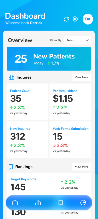
High-Contrast UI: Bold, distinct colors for positive and negative trends so owners can read them in any lighting.
Chunky, Tappable Cards: Designing for one-handed use (the "thumb zone") while walking down a hallway.
Zero Clutter: Generous white space to reduce cognitive load.
*We not only enhanced its visual appeal; we fundamentally transformed the way practice owners engage with their data. By streamlining the dashboard, we observed significant shifts in user behavior.
Conclusion
By concentrating on user context, we revolutionized a frustrating workflow into a seamless daily routine. No more straining to see. No more overwhelming data. We effectively converted a tedious data task into an empowering, compact tool that aligns perfectly with their busy schedules.

85%
Desktop-to-Mobile Conversion
Without on-the-move KPI access, tracking daily performance across remote teams or multiple locations becomes difficult
98%
Goal Completion Rate
Almost completely stopped session drop-offs. Users discover what they want right away.
42%
Insight-to-Action Rate
Owners were 42% more likely to take immediate business action directly from their phone.
Design Process
The biggest victory of this project wasn't what we added; it was what we took away. By putting this massive dashboard on a "data diet," the most valuable lesson I walked away with is that on mobile, clarity is the ultimate luxury. We didn’t just shrink a desktop app to fit a smaller screen—we fundamentally redesigned the experience for a completely different human context.
Want to see more of my projects?
All Projects

Michael Buenaventura
Digital Designer
Home
Work
Get in touch
Portal App
The Portal app puts vital business growth metrics directly into the hands of busy practice owners. The user-friendly interface delivers instant insights on the go. Performance tracking becomes completely effortless, keeping leadership connected to important milestones without needing a desktop setup.
Role
UX/UI Designer
Client
Doctor Genius
Timeline
18 Weeks
Platform
iOS & Android
Problem statement
Organizations need real-time data to compete, but cluttered mobile dashboards make small-screen interpretation frustrating. This poor on-the-go experience causes monitoring delays, paralyzes decision-making, and ultimately leads to missed business opportunities.
why is there a need?
Practice owners needed a quicker way to access their growth data while on the go, without the complexity of a desktop dashboard.
How can I support them
The app enables managers to access key reports and production data, allowing them to review performance metrics and make informed decisions anytime, anywhere.
Research Insight
In the healthcare marketing space, we know our users. Practice owners are balancing patient care, staff management, and clinic growth. They don’t have 15 minutes to pinch, zoom, and scroll through spreadsheets on a 6-inch screen.
Target Users
They are medical, dental, or therapy clinic owners managing 1 to 3 locations. They wear two hats: treating patients full-time and managing the financial health of a growing business.
Persona #1: Healthcare Owners
Decision-makers who need real-time insights to optimize operations and profitability.
Persona #2: Practice Managers
Professionals responsible for day-to-day operations, tracking performance, and ensuring efficiency.
Engagement Gap
Without on-the-move KPI access, tracking daily performance across remote teams or multiple locations becomes difficult
Decision-Making Delays
Relying on desktop or email-based reports slows decisions, risking missed opportunities and delayed issue responses.
Accessibility Problem
Healthcare practice owners and managers are frequently mobile, with no quick way to check live business data on the go.
Design Process
We couldn't just shrink the desktop experience. We had to rethink it. We stripped away the deep-dive analytics and filtered the data down to the "Greatest Hits"—the top metrics that actually move the needle for a clinic's bottom line.
Designing for the Move
High-Contrast UI: Bold, distinct colors for positive and negative trends so owners can read them in any lighting.
Chunky, Tappable Cards: Designing for one-handed use (the "thumb zone") while walking down a hallway.
Zero Clutter: Generous white space to reduce cognitive load.
*We not only enhanced its visual appeal; we fundamentally transformed the way practice owners engage with their data. By streamlining the dashboard, we observed significant shifts in user behavior.
Conclusion
By concentrating on user context, we revolutionized a frustrating workflow into a seamless daily routine. No more straining to see. No more overwhelming data. We effectively converted a tedious data task into an empowering, compact tool that aligns perfectly with their busy schedules.
85%
Desktop-to-Mobile Conversion
Without on-the-move KPI access, tracking daily performance across remote teams or multiple locations becomes difficult
98%
Goal Completion Rate
Almost completely stopped session drop-offs. Users discover what they want right away.
42%
Insight-to-Action Rate
Owners were 42% more likely to take immediate business action directly from their phone.
Design Process
The biggest victory of this project wasn't what we added; it was what we took away. By putting this massive dashboard on a "data diet," the most valuable lesson I walked away with is that on mobile, clarity is the ultimate luxury. We didn’t just shrink a desktop app to fit a smaller screen—we fundamentally redesigned the experience for a completely different human context.
Want to see more of my projects?
All Projects
Michael Buenaventura
Digital Designer
Home
Work
Get in touch
Portal App
The Portal app puts vital business growth metrics directly into the hands of busy practice owners. The user-friendly interface delivers instant insights on the go. Performance tracking becomes completely effortless, keeping leadership connected to important milestones without needing a desktop setup.
Role
UX/UI Designer
Client
Doctor Genius
Timeline
18 Weeks
Platform
iOS & Android
Problem statement
Organizations need real-time data to compete, but cluttered mobile dashboards make small-screen interpretation frustrating. This poor on-the-go experience causes monitoring delays, paralyzes decision-making, and ultimately leads to missed business opportunities.
why is there a need?
Practice owners needed a quicker way to access their growth data while on the go, without the complexity of a desktop dashboard.
How can I support them
The app enables managers to access key reports and production data, allowing them to review performance metrics and make informed decisions anytime, anywhere.
Research Insight
In the healthcare marketing space, we know our users. Practice owners are balancing patient care, staff management, and clinic growth. They don’t have 15 minutes to pinch, zoom, and scroll through spreadsheets on a 6-inch screen.
Target Users
They are medical, dental, or therapy clinic owners managing 1 to 3 locations. They wear two hats: treating patients full-time and managing the financial health of a growing business.
Persona #1: Healthcare Owners
Decision-makers who need real-time insights to optimize operations and profitability.
Persona #2: Practice Managers
Professionals responsible for day-to-day operations, tracking performance, and ensuring efficiency.
Engagement Gap
Without on-the-move KPI access, tracking daily performance across remote teams or multiple locations becomes difficult
Decision-Making Delays
Relying on desktop or email-based reports slows decisions, risking missed opportunities and delayed issue responses.
Accessibility Problem
Healthcare practice owners and managers are frequently mobile, with no quick way to check live business data on the go.
Design Process
We couldn't just shrink the desktop experience. We had to rethink it. We stripped away the deep-dive analytics and filtered the data down to the "Greatest Hits"—the top metrics that actually move the needle for a clinic's bottom line.
Designing for the Move
High-Contrast UI: Bold, distinct colors for positive and negative trends so owners can read them in any lighting.
Chunky, Tappable Cards: Designing for one-handed use (the "thumb zone") while walking down a hallway.
Zero Clutter: Generous white space to reduce cognitive load.
*We not only enhanced its visual appeal; we fundamentally transformed the way practice owners engage with their data. By streamlining the dashboard, we observed significant shifts in user behavior.
Conclusion
By concentrating on user context, we revolutionized a frustrating workflow into a seamless daily routine. No more straining to see. No more overwhelming data. We effectively converted a tedious data task into an empowering, compact tool that aligns perfectly with their busy schedules.
85%
Desktop-to-Mobile Conversion
Converted our desktop-only legacy users into daily mobile users within 60 days.
98%
Goal Completion Rate
Almost completely stopped session drop-offs. Users discover what they want right away.
42%
Insight-to-Action Rate
Owners were 42% more likely to take immediate business action directly from their phone.
Takeaway
The biggest victory of this project wasn't what we added; it was what we took away. By putting this massive dashboard on a "data diet," the most valuable lesson I walked away with is that on mobile, clarity is the ultimate luxury. We didn’t just shrink a desktop app to fit a smaller screen—we fundamentally redesigned the experience for a completely different human context.
Want to see more of my projects?
All Projects